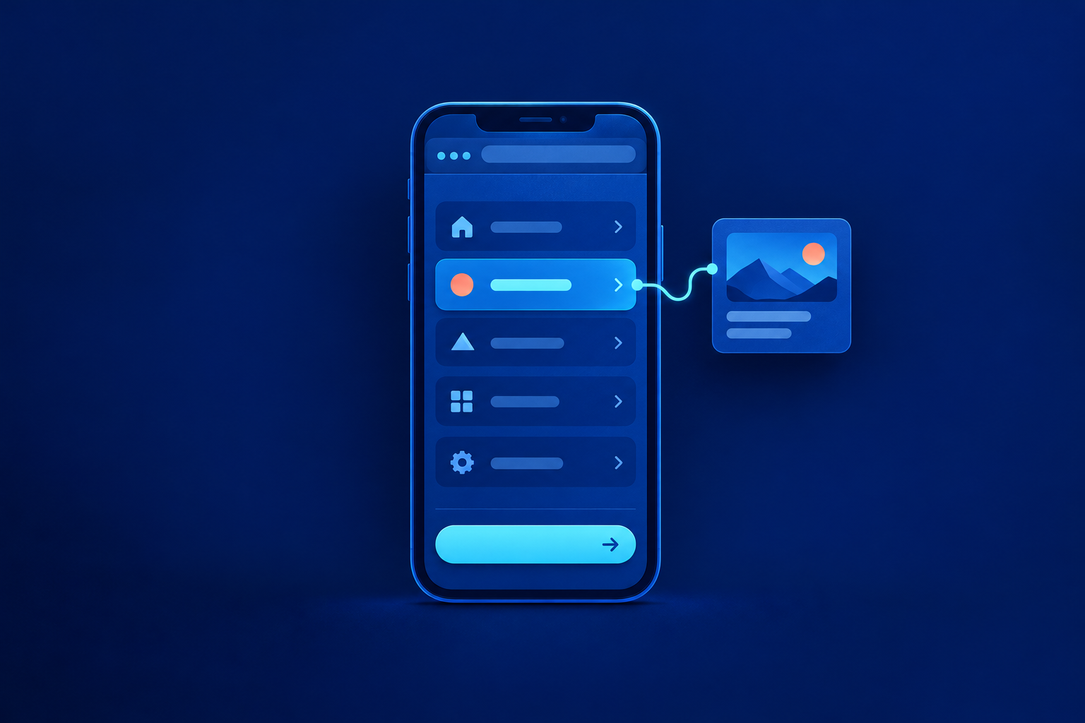
Improve mobile website navigation by making the main visitor tasks easy to recognise, reach and complete. Start with clear destination labels, keep a priority action visible only where it earns its space, and check that the menu works beyond touchscreen taps. Approve the changes after testing a complete journey, including what visitors expect after an enquiry.
Start with visitor tasks, not your company structure
Use recent enquiries, customer conversations and staff observations to identify recurring questions. These provide starting evidence, not a final ranking. A frequently requested telephone number may signal urgency, or simply information that is difficult to find. Validate priorities with visitors before giving every department a place in the mobile header.
Build a task-to-destination-to-action worksheet before discussing layouts. The example below uses a hypothetical office-furniture supplier that reviews quotations manually and has no live booking system. Replace its tasks with yours. The operational promise column matters: navigation must not offer a commitment the business cannot fulfil.
| Visitor question | Destination | Next action | Operational promise |
|---|---|---|---|
| Which desks suit our office? | Office desks | Review sizes and options | Describe available options accurately |
| Can you deliver here? | Delivery areas | Check coverage | Explain any confirmation needed |
| What would these desks cost? | Product-specific quotation enquiry | Request a quotation | Staff review; no order confirmed |
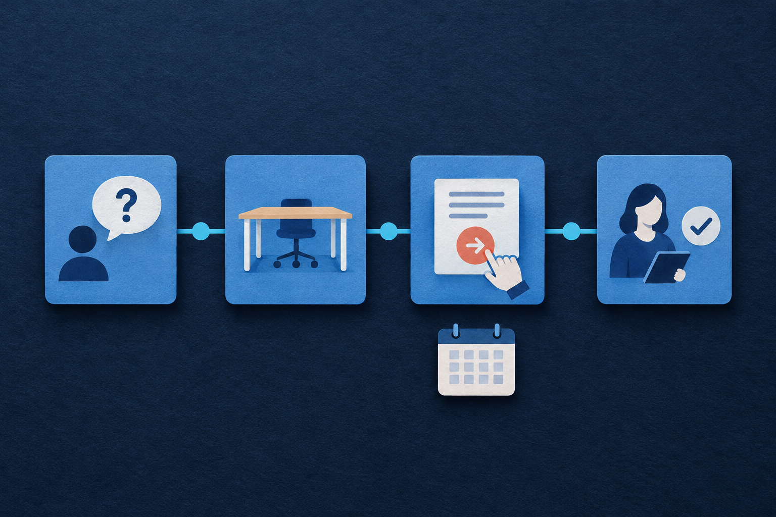
Navigation extends beyond the header. Global navigation connects the main areas of a site; local navigation connects related pages within one area. Contextual links connect the information someone is reading to a useful next destination. A product page’s delivery link can therefore be as important as the main menu. [2]
Write labels that reveal the destination
Ask what someone expects to find before showing them the destination. For the furniture supplier, “Office desks” is a candidate replacement for “Solutions”; “Request a quotation” could replace “Get started”. These are hypotheses to test, not universally better wording. Preserve familiar customer language rather than replacing it with internal product categories.
WCAG 2.2 requires link purpose to be understandable from the link text or its programmatically determined context. It also requires headings and labels to describe their topic or purpose. Naming a navigation region helps identify that region; it does not make unclear links inside it meaningful. Treat accurate wording and technical structure as separate checks. [1]
Choose what stays visible and what belongs in the menu
There is no universal best menu pattern or correct number of links. Compare the space available with the tasks visitors need most. A visible “Menu” label can make an icon’s purpose clearer. A persistent action may help returning buyers, but compete with useful information for visitors still deciding what they need.
| Option | Potential benefit | Trade-off to check |
|---|---|---|
| Inline expandable section | Reveals links within the page layout | May push page content down substantially |
| Slide-out drawer | Provides a separate navigation surface | Needs careful closing, focus and overlay behaviour |
| Persistent priority action | Keeps one important next step visible | Uses space and may obscure content |
| Visible destination links | Avoids opening a menu for those destinations | Long labels or enlarged text may not fit |
Approve menu behaviour beyond touchscreen taps
Ask the developer to demonstrate these checks, rather than reporting that the menu is “accessible”. Semantic navigation uses built-in HTML elements to communicate structure and controls. Ordinary website navigation generally does not need the ARIA menu role, which introduces expectations for more specialised keyboard behaviour. [3][4]
- Use a navigation landmark, normally a nav element, with an appropriate name where needed.
- Use a real button for the toggle and links for destinations.
- Give the toggle a clear accessible name and keep aria-expanded synchronised with visibility.
- Exclude collapsed links from keyboard navigation.
- Keep focus order logical and the focused control visibly identifiable.
- Check that sticky bars and overlays do not obscure focus; WCAG AA requires focused elements not to be entirely hidden.
- Provide a clear closing control; if a drawer behaves as a modal, verify its focus containment and return behaviour.
- Indicate the current page visually and programmatically, for example using aria-current="page".
These checks draw on WCAG and W3C menu guidance. [1][3] W3C’s disclosure-navigation example illustrates implementation ideas, but is not production-ready code. Its documentation warns about browser and assistive-technology support gaps, particularly on mobile and touch devices. Test the finished implementation with relevant devices and assistive technology, such as screen readers. [4]
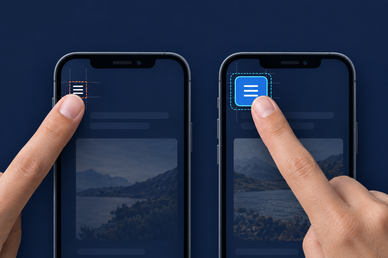
Measure the clickable area, not the icon
WCAG 2.2 Level AA specifies a minimum target size of 24 × 24 CSS pixels, subject to exceptions including spacing, equivalent controls and inline links. The spacing exception has a defined geometric test; a small gap is not automatically sufficient. Level AAA specifies 44 × 44 CSS pixels with its own exceptions. These are CSS pixels, not physical screen pixels. [1][5]
Use 44 × 44 CSS pixels or larger as a practical starting target for standalone menu buttons, close controls and priority actions. That is a design recommendation, not a universal AA obligation. Apply padding to the interactive element itself. Inspect its actual clickable boundary, then check neighbouring controls for accidental taps and sticky bars for obstruction.
Worked example: connect product browsing to a quotation
Hypothetical example, not client work: our office-furniture supplier wants an office administrator to assess desks, check delivery and request a relevant quotation. The following arrangement is a proposal to test. It is not evidence of customer preferences in India or elsewhere. Investigate language needs with actual customers rather than inferring them from location.
| Location | Proposed content | Journey purpose |
|---|---|---|
| Header | Business identity, Menu, Request a quote | Orient visitors and expose the enquiry route |
| Expanded menu | Office desks, Storage, Custom furniture, Delivery areas, Contact | Expose product and supporting destinations |
| Desk page | Dimensions, options, delivery-area link | Help visitors assess suitability |
| Page-level action | Request a quote for these desks | Carry product context into the enquiry |
| Acknowledgement | Enquiry received; explain manual review | Distinguish submission from confirmation |
- Find suitable desks and review dimensions and customisation options.
- Check the delivery area, then return without losing the product context.
- Request a product-specific quotation.
- Read the acknowledgement and explain what happens next: staff review the enquiry; no order or installation slot is confirmed.
Test realistic scenarios and record the friction
Give neutral prompts without revealing menu labels: find desks for a small office; check whether delivery reaches your locality; ask what they would cost; close navigation opened accidentally; find opening hours. Ask participants to explain what they expect after submitting an enquiry. Avoid directing them towards the control you want to validate.
Use real phones, enlarged text, keyboard checks and relevant assistive technology. Include disabled participants and record the devices and conditions covered. Combine user evaluation with standards checks: a small study neither establishes statistical significance nor proves full accessibility. W3C recommends involving users while avoiding generalisations from a few participants. [6]
| Check | Record | Approval condition |
|---|---|---|
| Destination recognition | First choice, hesitation, wrong turns | Observed label or grouping problems resolved and retested |
| Control activation | Accidental taps and failed attempts | Targets and spacing checked; observed issues retested |
| Menu operation | Open, close, focus and hidden-link behaviour | Developer checks pass on the agreed test scope |
| Journey continuity | Lost product context and backtracking | Visitor can reach the relevant enquiry route |
| Next-step understanding | Expected outcome after submission | Enquiry is not mistaken for an order or booking |
Mark each row pass, revise or not tested, with supporting observations. Tie changes to problems: revise grouping after repeated wrong turns, enlarge a control after accidental taps, or clarify acknowledgement wording after booking confusion. Retest the affected journey. Use Help the right B2B buyer start a useful conversation for wider enquiry context, and A website launch checklist built around what must work for release planning.
Common approval questions
Should the quotation button stay visible?
Test it where quotation requests are a priority task. Keep it only if it remains useful without crowding navigation, covering content or encouraging an enquiry before visitors understand the offer.
Should we remove the hamburger menu?
Not automatically. Compare a labelled menu button with visible destination links or an inline expandable section. Choose using task performance, available space and enlarged-text behaviour, not a blanket preference for one pattern.
Does every mobile link need to be 44 pixels tall?
No. WCAG AA’s minimum is 24 × 24 CSS pixels with exceptions; AAA’s 44 × 44 requirement also has exceptions. Use larger standalone controls as a practical baseline, while checking the applicable criterion for each target. [1][5]
For your next review, complete the worksheet for three priority tasks. Ask your designer and developer to demonstrate each journey on a phone, then attach the completed scorecard to approval. Approve working destinations, usable controls and an honest next step—not just a tidy menu screenshot.
Sources & further reading
Use the original guidance when checking details or planning implementation.
This research-assisted guide uses the primary sources linked above. Examples are illustrative unless explicitly identified otherwise. Check original documentation when implementing changes.